
Base Set Pokémon cards, the objects of affection and nostalgia for collectors, have played a key role in the hefty trading card boom of the late 1990s. These beloved cards contain layers of intricacies that only a true aficionado might recognize. When enthusiasts speak of Base Set cards, they often refer to three major waves released in 1999: the groundbreaking First Edition, the shadow-defying Shadowless, and the ever-popular Unlimited edition. Each of these editions has unique characteristics that can send a collector’s heart aflutter or make them ponder the vast expanse of their wallet.
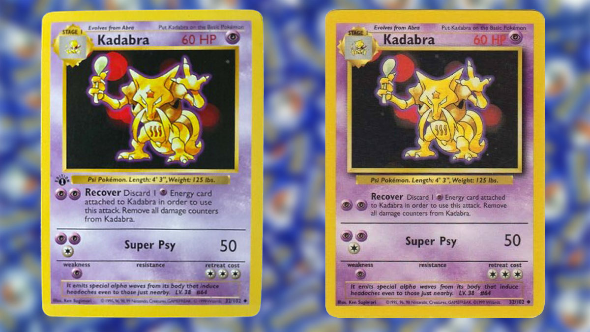
But why do these shadowed and shadowless descriptors that sound like something out of a fantasy novel matter? Well, let’s break it down.
Here’s the lowdown: Shadowless cards feature a frame around the Pokémon artwork that’s as flat as a pancake, with no gray drop shadow on the right side of the image. Created in the nascent stages of Pokémon card production, these cards also sport a thinner typeface that whispers, “notice me.” Later on, the design went on a journey to the land of utility belts and gravity defiance; it gained a shadow. This soft gray shadow on the right side of the art dramatically adds depth to the card, resulting in the commonly known shadowed or Unlimited prints.
The print order of these cards directly correlates with their rarity and subsequently influences the card’s market value. With Base Set cards initially arriving as First Edition, these were followed by the mysterious Shadowless, and eventually the hefty Unlimited print that stocked the shelves of toy stores through late 1999 and beyond.
So, why do collectors lose sleep over this shadowless conundrum? Simply put, rarity rules the roost in the world of collectibles. Shadowless cards hold a position smack dab in the middle of the scarcity spectrum. They are less prevalent than the widely circulated Unlimited cards yet more commonly found than the illustrious First Editions. This sweet spot has them often fetching prices well above their Unlimited counterparts, particularly when discussing iconic holographic cards like Charizard, Blastoise, and Venusaur. There’s power in a single word, and the grading companies know it—labeling a card “Shadowless” could send its value soaring.
Being able to identify these differences is akin to being handed the keys to a kingdom, but with cards instead of castles. When comparing shadowless versus shadowed cards, think of a side-by-side matchup in your mind’s eye.
First, focus on the picture frame. A Shadowless card presents a flat frame, missing the gray bar on the right edge of the art window that signifies a shadow. Conversely, a shadowed version employs a soft gray shadow that delivers that almost magical raised look.
Let’s talk text. The red “HP” text and its accompanying number differ between versions. Shadowless cards deploy a thinner print, where text and number are practically partners huddled on a cold night. Shadowed, on the other hand, goes bold, spacing them out like they’ve had an argument about the thermostat.
The tone of the border and ink can also be a subtle giveaway. Shadowless prints tend to don slightly lighter, buttery yellow borders and softer ink, whereas Unlimited counterparts often appear more vivid, more saturated. However, don’t solely stake your claim on this detail—it’s one among many.
Evolution boxes and attack texts are slimmer and finer on shadowless cards, while Unlimited cards went for the weightlifting option with thicker, bolder designs.
The copyright line stamps its foot in the argument too. Shadowless cards typically carry a compact, multi-year Nintendo, Creatures, GAMEFREAK line. Come Unlimited, the layout is tweaked with special attention to whitespace. But take this observation with a grain of salt, as lighting and wear can play mean tricks on your eyesight.
Ah, the holo layer and print pattern. On holographic cards, shadowless foils sometimes offer fewer servings of sheen and texture, offering a flatter aesthetic compared to their flashy Unlimited siblings.
Should you stumble upon sealed Eclipse boxes or booster packs, tread lightly but confidently—shadowless cards emerged from early Base Set boxes, which briefly graced store shelves compared to the heavily printed shadowed packs.
Let’s apply what we’ve learned to practical examples. The majestic Charizard, when sporting a First Edition stamp, is inherently shadowless. Without the stamp, this fiery lizard remains rare, standing out among the shadowed slew that most collectors recognize. In another example, don’t sleep on the starter deck’s Machamp, where a 1st Edition badge indicates a shadowless smile. Later iterations can boast of their shadows, making Machamp an excellent case study when training your discerning eye.
The story of shadowless cards extends to trainers and energy cards—everything within the base set family obeys the shadow rules. En route to ownership or grading, don your detective hat for these nuanced tells, and confirm your prize under bright, angled light to inspect for edge chipping, centering, and strong holo surfaces.
Bear in mind a few common pitfalls on your way to shadowless enlightenment. Shadowless applies solely to Base Set cards—not a Jungle or Fossil in sight. The UK-based 1999–2000 copyright line doesn’t insinuate shadowless rebellion either. Lastly, remember, thick versus thin stamp talk pertains only to First Edition—it has no dog in the shadowless fight.
With newfound expertise in hand, use this knowledge to organize your collection. When sorting through a nostalgic stack, trust your gut to spot that shadow absence on the art box. It may surprise you how intuitive it becomes, leading you to confidently categorize your cards and understand their true worth in the grand scheme of trading card lineage.