
Inspiration can tuck itself away in the most mundane of routines, like a daily subway ride. For Phil Imbriano, a senior designer at Topps, the creativity lightning bolt struck amidst the humdrum of his daily New York City commute. Who knew a nondescript red-and-silver badge nestled in the corner of a subway car could shape the look of baseball cards for an entire year? Imbriano snapped a photo of this eye-catching detail, and by the time he jostled through the city’s labyrinthine streets to his desk at Topps, his sketchbook was alive with potential designs.
Fast forward to today, and Imbriano’s inspired scribbles have metamorphosed into the gleaming 2025 Topps Series 1 baseball cards, officially launching to the delight of collectors everywhere.
“There’s beauty in ordinary things,” Imbriano mused, still slightly in disbelief over how this whimsical encounter under fluorescent train lights shaped his artistic direction. “It might be a building, a sign—just something mundane that briefly catches your attention. I snap a photo because you never can predict when that captured moment will snowball into a grand idea.”
The design he settled upon features two bold lines that elegantly sweep up the left side and glide across the top of the card. The design offers more than just aesthetic prowess; it nods warmly towards a past baseball card classic—the 1982 Topps set. However, Imbriano’s creation carries a fresh twist, as the sweeping lines are now color-matched to each team.
Funny enough, Imbriano wasn’t deliberately trying to conjure up nostalgia. He originally drew inspiration from the charmingly rustic woodgrain design that graced the 1962 and 1987 Topps collections. Regarding the 1982 connection, he smiled and said, “That was a fortuitous accident. Yet, it meshes well because it melds vintage allure with a sleek, modern flair.”
To rise to printing glory, Imbriano’s design had to emerge victorious in a spirited in-house competition at Topps, clamoring amongst over twenty submissions through a meticulous and prolonged selection process. At Topps, ideas are never abandoned, just deferred. Occasionally, fragments from past non-winning designs are repurposed in future sets. This year’s standout is a minor field graphic in the bottom right corner—a modest yet integral marker of a player’s position.
From the hazy days of subway doodles to a polished product poised for the world’s eyes, Imbriano churned through approximately ten distinct design versions before the team reached a tacit consensus on the final iteration.
“Many people don’t realize how much effort precedes the moment they finally clutch that card,” Imbriano confessed, outlining the laborious yet thrilling journey. “Designing these cards is no small affair.”
Bringing these cardboard dreams to life involves more than just pixel perfecting. Once the digital sketches are brushed with imaginative finesse, Topps crafts physical prototypes to scrutinize their tangible aesthetics. This tactile evaluation is paramount, emphasized Clay Luraschi, Topps’ senior vice president of product.
“When we narrow down our options to five promising designs, we convert digital files to tactile prototypes and stage a mock card pack revelation,” Luraschi elucidated. “Deciding the final design is one of our heated office debates each year.”
He continued, “We all bear the weight of Topps’ storied legacy on our shoulders. From Sy Berger’s homemade designs at his kitchen table to today’s high-tech wizardry, we ensure the tradition is respected. It’s no small feat—but it’s our labor of love.”
The base set is merely the starting lineup. Topps Series 1 sparkles with a roster of beloved subsets, each promising collectors additional treasures:
– Future Stars
– All-Topps Team
– Training Grounds, with exclusive Spring Training highlights
– A nod to baseball legends with Call to the Hall
– City Connect Swatch Collection Autographs
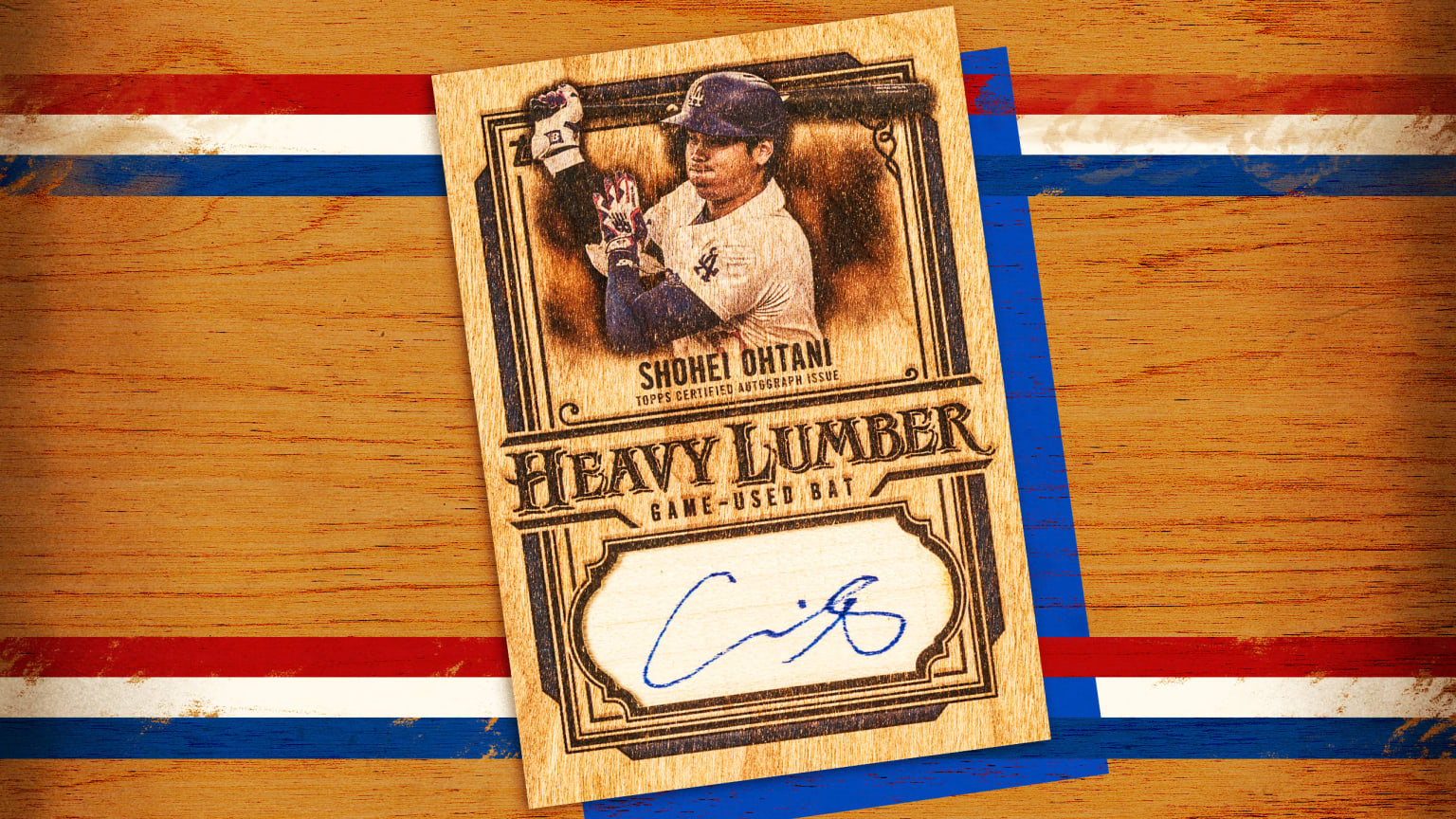
– Heavy Lumber Autographs
Returning crowd-pleasers like Signature Tunes again pair players with the musical artists behind their walk-up anthems, while First Pitch celebrates celebrities who ventured to the mound for ceremonial pitches last season. Those who bleed Dodger blue are in for an extra treat: exclusive base-card variations immortalizing iconic moments like the Freddie Dance—Freddie Freeman’s signature jig after reaching base.
A heartfelt 35th-anniversary tribute salutes the 1990 Topps set, renowned for its vibrant and audacious style. Yet, at the epicenter of this celebration sits Imbriano’s arresting new base design—a design with an elephantine memory and the spirit of a collector’s dream.
“Designing cards feels akin to crafting a movie poster,” Imbriano shared. “Every card should be a standalone masterpiece, a miniature cinematic poster resting in a collector’s palm.”
Luraschi concurred, “Phil’s design is a marvel. It perfectly captures an era. Fifty years from now, collectors should be able to glance at a card and instantly pinpoint its birth year. This design brilliantly accomplishes that.”